Creating a welcoming and usable digital home for a much-loved local museum
CLIENT: Virginia Museum of Fine Arts
PROJECT: Website redesign
“The reception of our new website has been wonderful. Visitors finally feel it matches their beloved museum, and their onsite experience.”
Project Brief
Redesign the VMFA website to capture the in-person spirit of the museum: a warm, hospitable community hub.
The Opportunity
The VMFA breaks ground on an ambitious new expansion and renovation project in summer 2026 that will add roughly 25% to their current square footage. Their old website was already feeling pretty dated, difficult to navigate, and wasn’t representing the vibrancy of the in-person experience. Our opportunity was to redesign their site to better support their current revenue drivers and set them up for their massive future strategic plan and expansion.
How we solved it
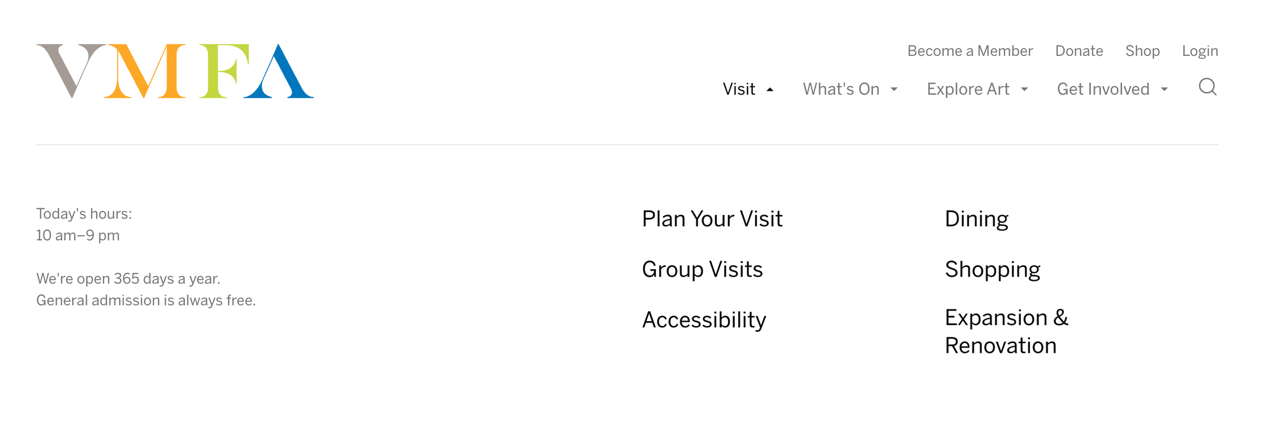
New streamlined navigation
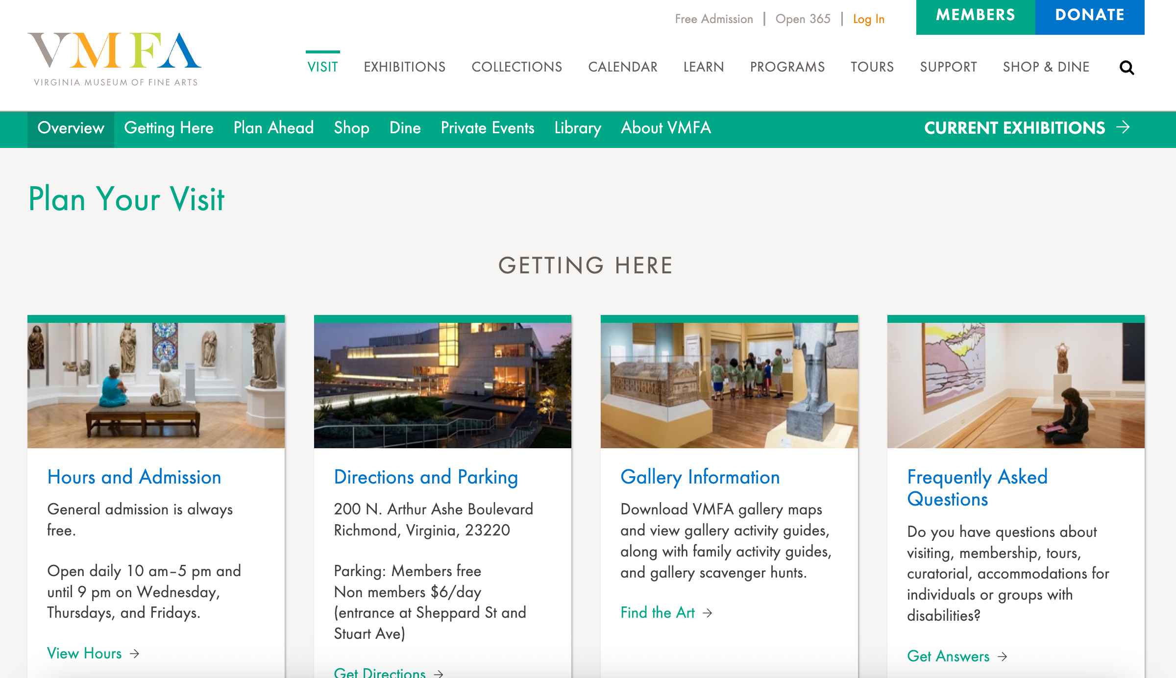
Previous navigation
User-facing navigation and information architecture
The existing navigation structure evidenced a problem we’ve seen across many institutions–the organization and naming conventions matched the institutional structure, but not user needs or expectations. The proliferation of primary navigation items and secondary navigation resulted in high cognitive load for users. We conducted user interviews to understand user needs, behaviors, and pain points, and then restructured the navigation to match users’ mental models.
The result is a streamlined experience with fewer but more intuitive entry points.
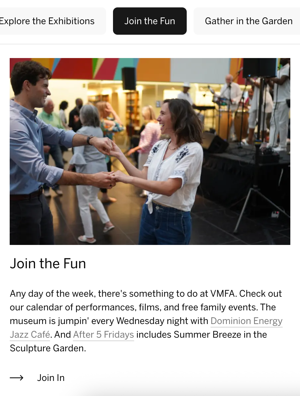
A purpose-built calendar experience
Based on our interviews with users, we discovered that a huge draw for VMFA loyalists is their classes, which frequently sell out once registration is launched. On the old calendar, classes were listed with other events, cluttering the calendar with offerings that were already sold out.
To solve this problem, we took inspiration from this user mindset of classes versus events and built a calendar with three tabs: one for exhibitions that have an extended time frame, one for events that occur on a shorter time frame, and one for classes where registration is required well in advance. We also added an events landing experience that allowed the events team to highlight the breadth of their event offerings–from talks and lectures to shopping and dining.
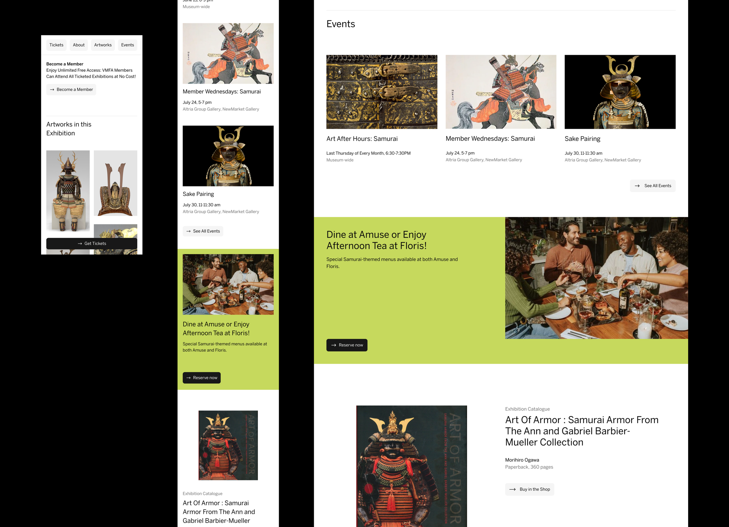
Exhibition pages to support organizational growth
With the planned renovation and expansion, VMFA is poised to double their special exhibition space: a key revenue driver through tickets and related programming. After talking to users and visiting the museum in person, we discovered that special exhibitions drove huge themed offerings across the museum–from must-attend events like Art After Hours to special drink and dining menus at their museum restaurant, Amuse.
In order to leverage this amazing museum-wide activation, we designed an exhibition page that didn’t just allow curators to memorialize their work in one place for other art historians to discover, but a place where the programming and shop and dining teams could also showcase their unique offerings. Prominent links to “Become a Member” and a sticky “Get Tickets” CTA make it very easy for the user to take action no matter where they are on the potentially long scroll experience. The exhibition page is also built to flex depending on how much information is available, from a minimal announcement state to a robust programming-laden open state to a post-exhibition state with resources and related editorial content.